
Something recently re-entered my mind from October 2017.
It perfectly ordinary day in which entrepreneur Bill Gross posts something on Twitter that inadvertently sends an entire generation spiralling into an existential crisis.
The subject?
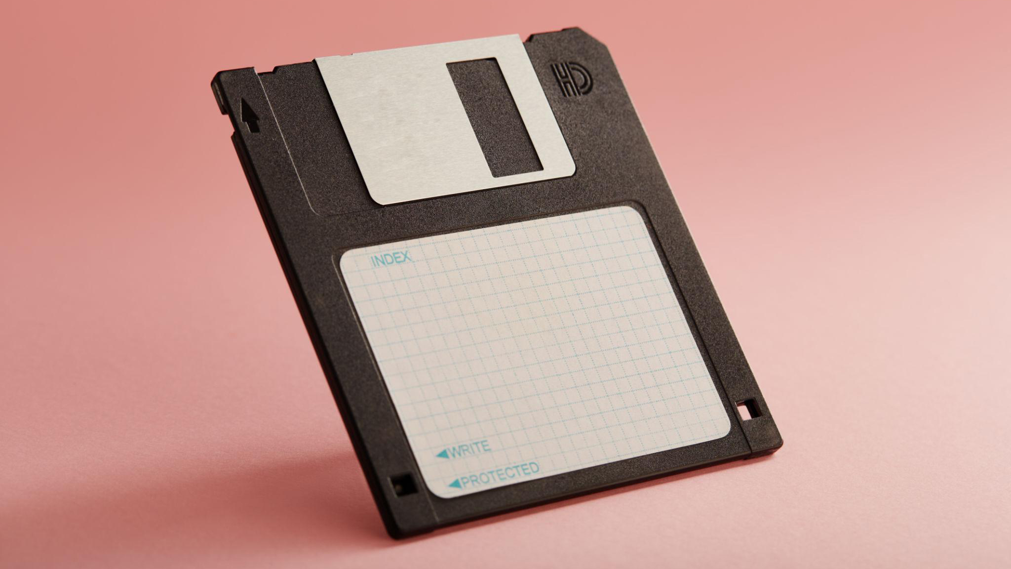
A floppy disk.
Remember those? Little plastic squares that held approximately three photographs, half a university assignment, and the ever-present possibility of catastrophic data corruption.
Well, apparently, a kid had encountered one of these prehistoric artefacts and made an observation that should probably qualify as a hate crime against millennials.
“Oh, you 3D-printed the Save icon.”
Excuse me?
The kid wasn’t joking. As far as they were concerned, the little plastic square was a physical reproduction of that familiar symbol sitting in the corner of their computer screen.
Not the other way around.
And just like that, several decades of technological history had been turned inside out.
I laughed.
Then I stopped laughing.
Because I remember floppy disks.
In fact, the last time I remember using one, I was a pie-faced kid of about six, saving my homemade business cards, which I’d lovingly designed in Adobe Illustrator using what I can only describe as every single default pattern swatch available.
Subtlety was apparently not part of the creative brief.
Yes, I was into graphic design at the age of six. No, I did not yet understand the concept of visual restraint, after all minimalism was a very long word.
But I did understand what a floppy disk was.
Which presented me with a rather uncomfortable question.
Am I old?

Absolutely bloody not.
Everything is still firm and lean, Korean skincare really is all that, green tea is not a myth, and I have more ideas than I have ChatGPT credits to execute them.
Besides, how can you have a midlife crisis when you don’t even know when you’re going to die?
Checkmate.
Existential catastrophe averted.
But something about that anecdote continued to bother me.
Because the kid wasn’t technically wrong.
To them, the floppy disk really was a physical version of the Save icon. The symbol had become more familiar than the object it was originally designed to represent.
And once you start thinking about that, the implications become rather odd.
We have entire generations using visual representations of technologies they’ve never encountered, navigating interfaces built around physical objects that disappeared before they were born.
And the design industry?
Still enthusiastically drawing floppy disks.
Which raises two awkward questions:
Have we actually progressed so far beyond the technology of the past that our visual language can no longer keep up, or have we simply become so comfortable recycling familiar designs that we’ve stopped inventing new ones?
and
Are we facing an intergenerational Tower of Babel moment?
Gen Z Isn’t Stupid. The Metaphors Are Ancient.
And before anyone starts preparing their obligatory kids these days monologue, the floppy disk is hardly an isolated incident.
In 2021, The Verge published an article titled File Not Found, documenting university professors discovering that their students were struggling with something many of us consider elementary computer literacy.
Files.
Folders.
Directory structures.
One astrophysicist teaching an engineering course found herself explaining the concept of locating saved documents to students who could operate sophisticated simulation software but had absolutely no idea where their work had gone.
Naturally, this was received in some corners of the internet as further evidence that Gen Z had somehow managed to become technologically illiterate while spending approximately seventeen hours a day staring at technology.
Except there’s a rather obvious flaw in that argument.
Why would somebody instinctively understand a filing system modelled on a physical office they’ve never worked in?
Think about it.
The original desktop metaphor was a stroke of genius. Computers were unfamiliar, intimidating machines, so designers borrowed the language of something people already understood: office administration.
Documents went into folders. Folders went into filing cabinets. Unwanted paperwork went into the wastepaper basket.
The whole thing made perfect sense to an audience who had spent their working lives handling paper.
But how many younger people have actually taken a manila folder, stuffed it with documents, labelled the tab and filed it alphabetically in a hulking metal cabinet?
For that matter, how many have ever needed to?
They grew up with smartphones, cloud storage, automatic synchronisation and search engines that can retrieve a document without the user remembering where they put it.
To them, information doesn’t necessarily live somewhere.
It’s simply available.
And frankly, when your phone can find a photograph of your dog from 2018 by searching for dog, explaining that it ought to reside in a carefully organised hierarchy of nested directories starts to sound suspiciously like insisting everybody learn how to operate a microfiche reader.
The same peculiar generational disconnect has emerged around analogue clocks.
In 2018, British schools were reportedly replacing analogue clocks with digital displays in examination halls because some students struggled to interpret the traditional clock face.
Cue another round of civilisation-is-collapsing commentary.
Except reading an analogue clock is a learned visual convention. Two rotating hands, twelve numbered positions, and a rather ingenious arrangement in which the number six sometimes means thirty.
It’s perfectly understandable once you’ve learned the system.
But it’s hardly an innate human ability.
And if you’ve spent your entire life glancing at a numerical clock on your phone, why would you necessarily develop the same fluency with its mechanical ancestor?
None of this means that hierarchical file systems or analogue clocks are useless. Both remain valuable, particularly in contexts where their underlying structures matter.
But there’s a difference between failing to understand technology and failing to recognise the historical conventions through which technology was once explained.
Technological literacy is not the same thing as technological archaeology.
Which brings us back to our apparently immortal floppy disk.
What happens when the physical objects that originally gave our digital symbols meaning disappear, but the symbols themselves remain?
Because it turns out humanity has been through this particular design problem before.
Several thousand years before somebody invented the Save button.
From Hieroglyphs to the Letter A
Now, I appreciate that going from floppy disks to Ancient Egypt might seem like an ambitious detour, but bear with me, because the Egyptians and their ancient neighbours were dealing with a remarkably similar design problem several thousand years before anybody had the bright idea of putting a computer on a desk.
How do you turn something recognisable into a symbol that communicates meaning?
Well, initially, you draw the thing.
A bird looks like a bird. An eye looks like an eye. An ox looks like an ox. Congratulations, you’ve invented something considerably more enduring than your average corporate rebrand.
Of course, Egyptian hieroglyphics were rather more sophisticated than a prehistoric collection of emojis. Their writing combined signs representing sounds, words and concepts, because apparently even the ancient Egyptians understood that communicating complex ideas required more than pointing at pictures of livestock.
But here’s where things get interesting.
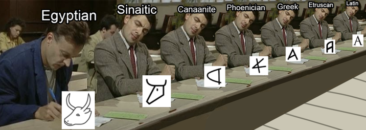
Among the early alphabetic signs developed by Semitic-speaking people influenced by Egyptian writing was a little drawing of an ox’s head.
The word for ox was aleph, and through a clever linguistic trick, the picture came to represent the initial sound of that word rather than the animal itself.
So far, so sensible.
Then the Phoenicians got involved, simplifying the symbol into something increasingly abstract. The Greeks subsequently adopted it, repurposed it to represent a vowel, and called it alpha. Eventually, through further adaptations, including those of the Etruscans and Romans, we arrived at the familiar Latin letter A.
Yes.
The first letter of the alphabet was once a cow’s head.
Several thousand years of civilisation, literature, philosophy and typography, and we’re essentially beginning our sentences with heavily stylised cattle.
And the wonderful thing is that nobody finds this remotely confusing.
Nobody looks at the letter A and complains that it bears absolutely no resemblance to an ox. Nobody marches into a typography conference demanding that we abandon this archaic bovine imagery in favour of something more representative of contemporary agriculture.
We simply learn that A means A.
The original object has become irrelevant to our understanding of the symbol.
Sound familiar?
That’s precisely what’s happening with the floppy disk.
To somebody who has never encountered the physical storage medium, the Save icon isn’t a picture of obsolete computer hardware. It’s an established visual character meaning save this thing.
The connection between the image and its original object has effectively been severed, while the meaning of the symbol survives perfectly intact.
And suddenly, the kid who thought somebody had 3D-printed the Save icon doesn’t seem quite so ridiculous.
They’re doing exactly what generations of people have done with written language: learning the meaning of a symbol without needing to know its entire archaeological backstory.
The floppy disk hasn’t merely outlived the technology it represents.
It’s graduated from illustration to language.
Which sounds like a rather distinguished achievement for something that once struggled to accommodate a moderately ambitious PowerPoint presentation.
But there’s a catch.
The evolution of written language took thousands of years, during which symbols were gradually adapted, simplified and repurposed.
Our digital iconography has achieved a similar separation from its physical origins in just a few decades.
And while the letter A has had centuries to settle into its current form, the Save icon is still sitting there looking suspiciously like something you might find in a box of abandoned office supplies.
So perhaps the more interesting question isn’t why we continue using obsolete symbols.
It’s why we haven’t come up with anything better.
And when you look at what modern technology actually looks like, you begin to suspect there’s a fairly ridiculous explanation.
The Telephone Receiver and the Great Iconographic Extinction
Of course, the floppy disk isn’t the only technological corpse still enjoying a successful career in interface design.
Take the telephone.
Somewhere on your smartphone is a little picture of a telephone receiver, usually one of those satisfyingly curved handsets that once lived attached to an enormous plastic brick with a spiral cord.
When was the last time you actually used one of those?
We’ve spent the better part of two decades turning telephones into increasingly sophisticated glass rectangles, yet the universal instruction for making a call remains a picture of something you might find on a receptionist’s desk in 1987.
Email is represented by a paper envelope, despite the entire point of email being that you don’t need to put anything in an envelope. Digital photographs are represented by cameras that look suspiciously like the ones your parents took on holiday. Documents are still sheets of paper with a folded corner, and folders apparently continue to exist in a world where most people haven’t bought a filing cabinet in their lives.
It’s beginning to look less like a software interface and more like the contents of an exceptionally well-preserved office supply cupboard.
But before we accuse the entire design industry of having developed a collective nostalgia fetish, there’s a rather awkward practical problem.
What exactly are we supposed to replace these icons with?
Because somewhere along the road to technological progress, we’ve managed to make practically everything look the same.
Think about the wonderfully distinct silhouettes of twentieth-century technology. Telephones had handsets. Cameras had lenses, viewfinders and all sorts of mechanical protrusions. Radios had knobs and aerials. Typewriters had keys, carriages and enough moving parts to frighten a modern product designer into early retirement.
You could recognise most of these objects from their outlines alone.
Now consider a smartphone, an external SSD, a portable battery, a tablet and any number of electronic devices currently occupying the average desk.
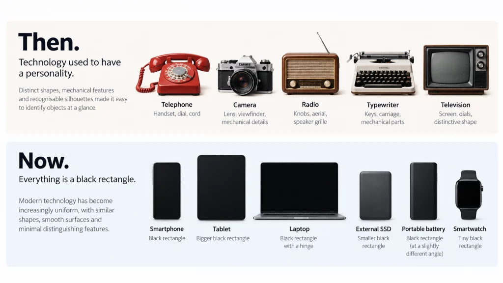
Black rectangle.
Slightly larger black rectangle.
Black rectangle with rounded corners.
Expensive black rectangle with a logo.
We’ve stripped away the mechanical features that once communicated an object’s purpose, replacing them with smooth enclosures, touchscreens and the occasional port that will inevitably be removed in the next product generation.
From an engineering perspective, much of this is perfectly sensible. From an icon designer’s perspective, however, it’s an absolute nightmare.
How do you communicate the concept of a telephone using a silhouette that’s virtually indistinguishable from a portable hard drive?
You could add a little antenna, but congratulations, you’ve just invented a phone from 2003.
You could draw the screen displaying a call, but now you’re using another icon to explain the first icon, which feels suspiciously like the beginning of a very expensive design meeting.
The older objects, for all their technological limitations, possessed something their modern counterparts increasingly lack.
An immediately recognisable physical identity.
And when an object loses that identity, the symbol originally based on it becomes strangely more useful than the object itself.
The old telephone receiver communicates call more effectively than a faithful drawing of an actual contemporary telephone.
Which is ridiculous.
But also rather brilliant.
We’ve made technology so minimalist that we’ve accidentally designed the objects out of their own iconography.
And nowhere is this problem more entertaining than when you attempt to replace the humble Save button.
The Impossible Task of Redesigning Save
Right, let’s conduct a little experiment.
You’re a UX designer working for a large technology company, and somebody in upper management has decided that the floppy disk icon is looking a bit dated.
Fair enough. It is, after all, a piece of technology that went out of fashion around the same time as frosted eyeshadow and dial-up internet.
Your assignment is simple: design a new Save icon.
It needs to be instantly recognisable, culturally neutral, accessible to people of different ages and backgrounds, and sufficiently intuitive that nobody has to consult a user manual to understand it.
Oh, and it needs to fit inside a square approximately sixteen pixels wide.
Off you go.
Perhaps we should start with something contemporary, like an external SSD?
Excellent. You’ve drawn a black rectangle. Unfortunately, it could also be a power bank, a smartphone, a particularly uninspired chocolate bar, or one of the other fourteen black rectangles currently sitting on my desk.
What about a cloud?
Well, congratulations, you’ve illustrated the weather. Depending on the interface, you may also have suggested uploading, downloading, synchronising, backing up, or the imminent arrival of rain.
A downward arrow?
Download.
An arrow pointing into a box?
Import. Archive. Install. Possibly a very stern instruction to put something away.
A padlock?
Security.
A treasure chest?
Lovely, but unless we’re designing the inventory system for an RPG, probably not.
You see the problem.
Saving isn’t really an object. It’s an action that preserves information, and the physical objects we once associated with that action have largely disappeared from everyday use.
So perhaps we’re approaching this from the wrong direction.
Instead of representing the technology involved, why not represent the concept of saving?
How about Jesus Christ?

Hear me out.
He’s quite literally a saviour. The symbolism has centuries of brand recognition, and there’s certainly no shortage of existing artwork to draw inspiration from.
Unfortunately, I suspect Apple, Microsoft and Google might struggle to agree on a crucifixion-themed toolbar icon. Not to mention the inevitable complaints from approximately three-quarters of the world’s religious and nonreligious population.
Fine. Religion is out.
What about a goalkeeper catching a football?
Someone is saving something. The action is immediately recognisable to football fans, and we could probably make a rather satisfying little animation out of it.
Except now we’ve introduced a sporting reference that doesn’t necessarily translate across cultures, languages or audiences. And at sixteen pixels, our goalkeeper is going to look suspiciously like a person being attacked by a small circle.
Perhaps we could use a pair of cupped hands?
Are we saving a document, making a donation, receiving a gift, or asking the computer to place something gently into our care?
This is getting ridiculous.
But there’s a serious design problem hiding underneath the increasingly desperate attempts to squeeze Jesus Christ into a toolbar.
A symbol doesn’t become intuitive simply because the designer has found a clever metaphor for it.
It becomes intuitive when the people using it understand what it means.
And those are two very different things.
The floppy disk may be an objectively terrible illustration of how contemporary computers store information, but it’s an exceptionally successful piece of visual communication. Millions of people have learned its meaning, and that shared understanding has become more useful than the physical resemblance that originally gave it purpose.
Replace it with a theoretically more accurate symbol, and you may actually make the interface harder to use.
Which is a rather uncomfortable conclusion for an industry perpetually obsessed with redesigning things.
Sometimes the old solution survives because it’s genuinely effective.
Sometimes it survives because everyone has already learned it.
And sometimes, of course, those two explanations are practically indistinguishable.
So perhaps the problem isn’t that designers are incapable of inventing something new. Perhaps certain conventions have accumulated so much collective familiarity that replacing them would require everybody to agree to forget something they already understand.
And if that sounds like a strange way to design the future, you might want to take a look at your keyboard.
Because we’ve been doing precisely that for well over a century.
The Ghosts in the Machine: QWERTY and Obsolete Engineering
Take a look at your keyboard.
Specifically, the top row of letters.
QWERTYUIOP.
An arrangement so familiar that you probably haven’t given it a second thought since somebody first taught you to type. Yet its origins stretch back to the nineteenth century, when Christopher Latham Sholes and his fellow inventors were attempting to make the typewriter a commercially viable piece of office equipment.
And the typewriter, unlike your laptop, was a wonderfully temperamental mechanical contraption.
Every keystroke operated a physical mechanism, swinging a metal typebar towards an inked ribbon and a sheet of paper. Get the machinery tangled up and your productivity came to an abrupt halt.
One popular explanation for the QWERTY arrangement is that frequently used letter combinations were deliberately separated to reduce mechanical jams. Historians have since proposed alternative explanations, including the needs of telegraph operators transcribing Morse code, so the precise reasoning remains disputed.
But whatever combination of mechanical and practical considerations produced the layout, one thing is certain.
Your touchscreen doesn’t have typebars.
There are no tiny metal arms lurking beneath your smartphone keyboard, poised to collide because you’ve typed an enthusiastic email too quickly.
And yet we’re still using essentially the same letter arrangement that entered commercial use in the 1870s.
On glass.
With our thumbs.
Which is a rather spectacular achievement for an interface designed around machinery that no longer exists.
Of course, alternative keyboard layouts have been developed over the years. Dvorak, Colemak and various experimental arrangements have all attempted to rethink typing efficiency, ergonomics or the increasingly peculiar business of entering text on a touchscreen.
But QWERTY has something they don’t.
About a century and a half of collective muscle memory.
Changing it would mean asking an enormous number of people to relearn something they can already do without thinking. And for what? A potential improvement that may or may not justify the inconvenience, depending on how and what they type?
At some point, an engineering decision becomes a convention, and the convention becomes so thoroughly embedded in everyday life that its original justification barely matters.
And that’s where things get interesting.
Because QWERTY isn’t merely an example of outdated technology surviving in a modern interface. It’s evidence that the design of something can outlive the original problem it was invented to solve.
The mechanical typewriter disappeared from everyday use, but the layout survived electric typewriters, desktop computers, laptops and eventually made the rather absurd leap onto touchscreens.
Just as the floppy disk became the Save icon, the typewriter keyboard became the standard arrangement for entering text.
Neither requires its original machinery to remain useful.
And neither is particularly easy to replace.
So perhaps the question isn’t whether a convention is old, but whether its continued usefulness outweighs the opportunities we’re sacrificing by keeping it.
Because there’s an important distinction between preserving something because it works and preserving something because nobody can remember why we started doing it in the first place.
Which brings us to another curious development in interface design.
At some point, the industry collectively decided that all those lovingly rendered leather textures, wooden bookshelves and three-dimensional buttons were terribly old-fashioned.
Everything needed to become flat.
Modern.
Minimalist.
And yet, beneath the fresh coat of paint, the same old filing cabinets, telephone receivers and floppy disks were still sitting there.
Apparently, we’d decided to redesign the furniture without questioning why we were still living in the office.
Skeuomorphism: We Removed the Textures but Kept the Ghosts
Now, if you were using an iPhone around 2012, you might remember a period when Apple apparently believed every piece of software should resemble something you’d find in an unusually expensive gentleman’s study.
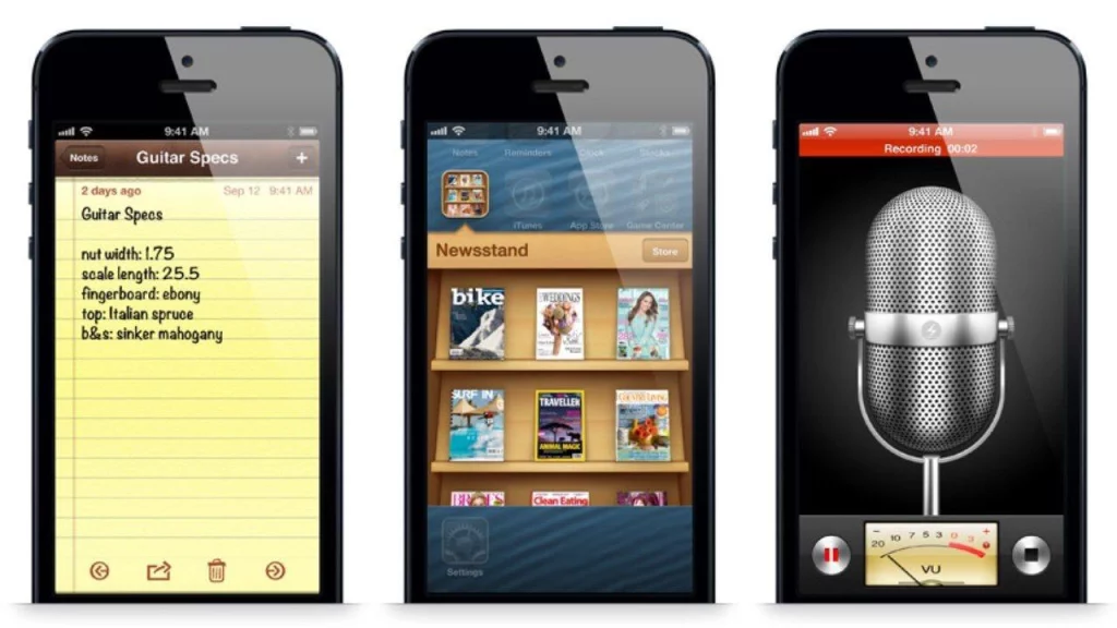
The calendar had stitched leather. Notes looked like yellow legal paper. Books sat on wooden shelves. Buttons glistened as though somebody had been polishing them with furniture wax, and the whole interface had the general aesthetic of a luxury stationery shop attempting to launch a technology company.
This was skeuomorphism, the practice of borrowing the appearance and characteristics of familiar physical objects to make unfamiliar digital interactions easier to understand.
And to be fair, it was a genuinely useful idea.
When computers first started finding their way into ordinary homes and offices, people needed some indication of what these strange new machines were supposed to do.
A folder looked like a folder. A button looked like something you could press. A wastepaper basket looked like somewhere you could dispose of the seventeen competing versions of a document you’d been pretending to finish since Tuesday.
The physical world provided a ready-made vocabulary for navigating the digital one.
Then, somewhere around the early 2010s, the design industry collectively decided it had had quite enough of the upholstery.
Out went the leather stitching, glossy buttons, embossed textures and ornamental shadows. In came flat colours, simplified shapes, delicate typography and icons so minimal that occasionally you had to poke them experimentally to establish whether they were interactive.
Apple’s iOS 7 redesign in 2013 became one of the most recognisable moments in this transition, although Microsoft and others had already been pursuing flatter visual approaches.
Suddenly, everything was clean.
Everything was modern.
Everything was minimal.
And if your interface still contained a convincing representation of a wooden bookshelf, you were presumably escorted out of the design department and asked to reconsider your career choices.
But here’s the funny thing.
We removed the textures. We didn’t remove the metaphors.
The wooden bookshelf disappeared, but the idea of organising digital objects into recognisable physical categories remained. The leather calendar lost its stitching, but we still arranged our appointments around the visual conventions of a paper planner.
Our documents were still represented by sheets of paper. Our emails still arrived in envelopes. Our files still lived in folders, and the floppy disk was apparently granted diplomatic immunity from the entire redesign.
We’d spent years enthusiastically removing every visual reference to physical materials while continuing to organise our digital lives around the same objects.
Essentially, we’d redecorated a 1980s office in Scandinavian minimalism and declared the future had arrived.
Now, there’s nothing inherently wrong with that.
A familiar metaphor can remain useful long after its original appearance has become unfashionable. And abandoning every established convention simply to demonstrate that your design team owns the latest software would be an extraordinarily expensive way of confusing people.
But the transition from skeuomorphism to flat design does expose something curious about how we think about progress.
We often treat a change in appearance as evidence of a change in underlying design.
Strip away the decoration, reduce the colours, replace the shadows with white space, and suddenly the interface feels contemporary, even when the fundamental interactions haven’t changed at all.
Of course, flat design brought genuine advantages, particularly for adapting interfaces across different screen sizes and simplifying visual complexity. And the subsequent return of shadows, depth and clearer interactive cues demonstrated that perhaps we’d been a little too enthusiastic about making absolutely everything look like printed cardboard.
But it also raises a slightly uncomfortable question.
How much of what we celebrate as innovation is actually innovation, and how much is simply a new aesthetic applied to an old idea?
Because the desktop metaphor was originally designed to help people understand computers by relating them to their existing experiences.
Decades later, those experiences have changed almost beyond recognition, yet many of the metaphors remain.
The people who first encountered these interfaces had filing cabinets, desk telephones and stacks of paperwork.
Their grandchildren have cloud storage, conversational AI, smartphones and an increasingly tenuous relationship with the idea that a document must exist in a particular place at all.
And we’re still explaining the future using illustrations from the stationery cupboard.
Perhaps that’s a sign of a visual language reaching maturity.
Or perhaps we’ve become so good at making the familiar look fashionable that we’ve forgotten to ask whether it still makes sense.
We didn’t replace the language of computing. We simply changed its typography.
Which leaves us with a rather awkward question for an industry that prides itself on being at the forefront of innovation.
Have we reached peak interface design?
Or have we simply become afraid to invent anything that requires people to learn something new?
Have We Reached Peak Design? The Future Is Being Written in Dead Languages
It’s a slightly ridiculous question when you consider that we’re currently developing artificial intelligence, spatial computing and devices that would have looked like witchcraft to somebody operating a typewriter in 1890.
And yet, the visual language through which we interact with much of this technology remains remarkably familiar.
The UX industry has spent decades perfecting the principles of intuitive design. Consistency, accessibility, recognisability, reducing cognitive load. All extremely sensible ambitions, particularly when you’re attempting to make increasingly complicated systems usable by several billion people.
But there’s an awkward side effect.
The more familiar an interface becomes, the more expensive it is to change.
Not necessarily in terms of development costs, but in the collective effort required to teach everybody what the replacement means.
Imagine being the designer tasked with replacing the Save icon across an entire operating system. You spend six months conducting research, developing concepts and testing alternatives, only to discover that the most effective solution is the little plastic square you were specifically hired to get rid of.
Congratulations. You’ve just spent half a year professionally rediscovering 1995.
And this is where the idea of innovation becomes a little complicated.
We tend to celebrate designers for inventing new things, yet much of good UX design involves the exact opposite: resisting the temptation to reinvent something that people already understand.
Nobody particularly wants to relearn how to operate their computer every time an enthusiastic creative director decides rectangles are out and triangles are the future.
But if every new idea must resemble something we’ve already encountered, how do genuinely new interaction languages ever emerge?
Design systems, component libraries and established interface conventions have made it easier than ever to produce consistent digital experiences. They’re enormously useful, but they also make it remarkably convenient to build tomorrow’s products using yesterday’s vocabulary.
And now we’re introducing generative AI into the process, systems trained on vast collections of existing human designs, with a rather obvious tendency to reproduce familiar patterns unless someone deliberately pushes them elsewhere.
There’s a delicious irony in the possibility that our most futuristic design tools might become exceptionally efficient machines for preserving the past.
Of course, there’s another way of looking at all this.
Perhaps the persistence of these symbols doesn’t represent stagnation at all.
Perhaps it represents maturity.
After all, nobody expects the English alphabet to undergo a dramatic visual rebrand every decade. We don’t accuse the letter A of lacking innovation because it no longer resembles the ox’s head from which its distant ancestors emerged.
We recognise that writing works precisely because its symbols have become stable, widely understood conventions.
And perhaps digital iconography is undergoing something similar.
The floppy disk has stopped being a picture of a storage device and become a character in an emerging visual language.
The telephone receiver no longer needs to resemble the object in your pocket. It simply means call.
The envelope means message.
The folder means organise.
They’re no longer instructions to interact with physical objects. They’re words in a vocabulary we’ve collectively learned to read.
Which makes the accusation that our interfaces are stuck in the past rather more difficult to sustain.
Because there’s a difference between a design becoming obsolete and the object it depicts becoming obsolete.
And there’s an equally important difference between an industry preserving useful conventions and an industry becoming incapable of imagining alternatives.
Perhaps we haven’t reached peak design.
Perhaps we’ve reached the point where some parts of design have become language, and changing them simply for the sake of appearing modern would be about as useful as redesigning the alphabet because the letter B is looking a little dated.
But that doesn’t mean the language itself should stop evolving.
As technology moves beyond screens, windows, buttons and folders, we’re going to encounter interactions that can’t be adequately explained through the contents of a twentieth-century office.
And when that happens, I hope we’re willing to invent something genuinely new rather than desperately searching the stationery cupboard for another metaphor.
Because there’s something both wonderful and faintly absurd about the situation we’ve created.
We’ve spent decades building increasingly sophisticated machines, capable of generating images, understanding speech, navigating virtual worlds and doing things their inventors could scarcely have imagined.
Yet we’re still using an ox’s head to begin the alphabet, a Victorian typewriter arrangement to communicate with artificial intelligence, and a floppy disk to tell our computers to remember something.
The future is being written in dead languages.
And perhaps that’s not evidence that design has failed to evolve.
Perhaps it’s evidence that some designs have become so successful they’ve outlived the very world that gave them meaning.
The floppy disk survived the death of the floppy disk.
Now I’m wondering whether design is trying to do the same.