My deep-dive into color pedantry started with the Sennelier 120 half-stick tester box, because apparently I enjoy creating future supply-chain problems for myself in French.
It was meant to be sensible.
A sampler.
A charming little pigment buffet.
A way to explore dry pastel without immediately flinging myself into the full 500-plus shade cathedral of À L’Écu Sennelier like a woman with no fiscal supervision.
Naturally, I began running out of the exact colors I actually use.
This is where the comedy begins, because Sennelier makes 525 soft pastel colors, and my favourite art shop stocks about 180 of them.
Which sounds generous until the color you need is not there.
Then 180 colors stops being abundance and starts feeling like a targeted insult.
To be fair, the owner is lovely and will happily order any missing color in for me.
Which is excellent customer service — and a dangerous invitation for me to become absolutely unbearable.
Because suddenly the question is not:
- Can I get the right color?
The question is:
- How much of my life am I prepared to surrender to the fantasy of the right color?
- Do I wait two weeks for The Correct Stick?
- Do I halt a piece because one specific blue-gray is temporarily unavailable?
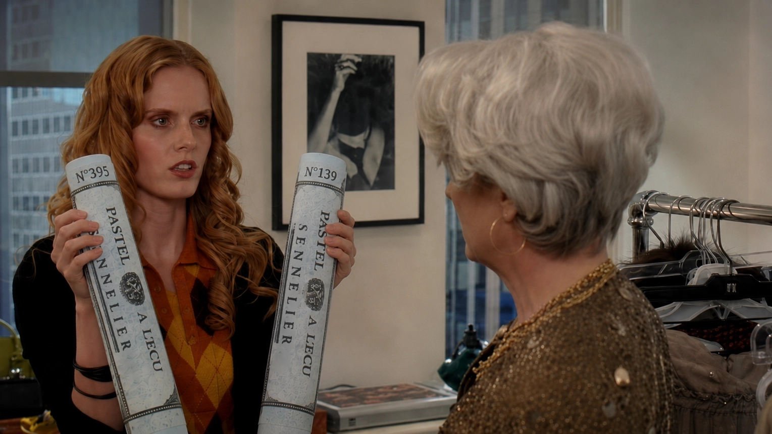
- Do I pretend Sennelier 395 and 139 are spiritually distinct entities when, to the naked eye, they are essentially the same color wearing different paperwork?
Obviously, I want the right color.
I am not an animal.
But there is a point where color precision stops being discipline and becomes a hostage situation.
Physical Color Is Already Tempestuous
As you can see, the above situation is already teetering on the brink of madness before fixative even enters the room carrying a pressurized can of consequences.
Because nothing humbles color certainty quite like spraying a finished pastel piece and watching the tonal structure change in real time.
Sennelier fixative does not gently preserve pastel work.
It arrives like an aerosolised chaos deity and says: “Nice values you had there. Be a shame if someone deepened them.”
The same pastel shifts depending on paper, pressure, layering, light, blending, tooth, batch variation, and whether I have bullied it into submission with the side of my hand.
Yarn people know this too.
Dye lots exist because color is not an abstract promise. It is chemistry having a mood.
Buy the same yarn in the “same” color from two different lots and suddenly your jumper has one sleeve from a parallel universe.
And that is physical color.
Pigment. Fibre. Matter. Actual stuff.
So imagine the sheer optimism required to think digital color is going to behave itself.
Welcome to the Brand Blue Tribunal
Which brings me to the realm of UI design.
Because there is an entire corner of digital product culture where people behave as if users are standing in front of interfaces with a color chart, ready to prosecute the brand blue.
Somewhere, right now, a room full of adults is debating two shades of blue so similar they could only be separated by a spectrophotometer and a stakeholder with unresolved control issues.
One blue is “more trustworthy.”
One blue is “cleaner.”
One blue has “better conversion energy,” which is the sort of phrase that should cause a small trapdoor to open beneath the meeting table.
Let’s say your design team finally chooses The Blue™.
Congratulations.
Now release it into the swamp.
The User Is Not Inside Your Figma File
The actual user is not gazing at your button on a calibrated studio monitor while Gregorian chanting softly in the background.
They are looking at it through a yellowed screen protector, fingerprint fog, 38% brightness, Night Shift, Dark Mode, adaptive color tone, a bargain OLED panel, and possibly some degree of color blindness.
And here are the receipts:
1. Different phones do not show color the same way
Your “brand blue” is not going to one screen.
It is going into a fragmented global zoo of OLEDs, LCDs, budget panels, flagship panels, color modes, manufacturer tweaks, battery savers, accessibility settings, and whatever screen protector someone bought in a three-pack from a petrol station.
In 2025, Apple led global smartphone shipments with about 20% market share, while Samsung followed with 19%, and Xiaomi held 13%. Meaning even the two biggest brands together accounted for less than half the market. The rest is a device soup of Xiaomi, vivo, Oppo, Transsion, Honor, Motorola, Google, and assorted glowing rectangles with their own panel choices and color handling.
The “best” screens are a tiny elite, not the default user reality.
We do not have a neat public census of how many laptops in circulation are color-accurate enough to satisfy a design review goblin. Which is, frankly, part of the problem. Designers often talk as though color-accurate displays are the baseline, when they are treated by reviewers as premium features worth testing, ranking, and celebrating separately.
DXOMARK’s 2025 display ranking put the Google Pixel 10 Pro XL at the top with 161 points, with the Pixel 10 and Samsung Galaxy S25 Ultra at 160. That is useful precisely because these devices are exceptional enough to be ranked as exceptional.
Laptop Mag’s 2025 testing praised the 16-inch MacBook Pro display for strong color accuracy, reporting 113% DCI-P3 coverage, 398 nits of brightness, and a Delta-E score of 0.26. Again: lovely. Also: not the median human experience.
Designing every color conversation as if the user is staring at a MacBook Pro in a softly lit studio is not strategy.
It’s fanfiction with a color profile.
2. Screens are deliberately altering color temperature
We are not merely dealing with “different screens.”
We are dealing with screens that are actively, intentionally, and user-configurably changing color.
Your blue is entering a witness protection programme at sunset.
Apple’s Night Shift automatically shifts display colors toward the warmer end of the spectrum after dark, and Android’s Night Light reduces blue light based on time of day and location, with later Android versions adding intensity controls.
One 2024 observational study on blue-light filter use found that 9.7% of respondents used blue-light filters regularly and another 9.7% used them occasionally. So, roughly one in five people in that sample were actively tampering with your chosen blue. Perhaps not maliciously. But spiritually? Suspicious.
3. Dark Mode is huge, messy, and changes color relationships
Dark Mode does not just “make things dark.”
It changes contrast relationships, perceived saturation, edge clarity, fatigue, and whether your lovingly debated blue suddenly looks like a tiny LED screaming in a cave.
Android’s own accessibility guidance warns that expanded Dark Theme can cause issues including inverted images and unreadable text on images.
A widely cited Android Authority poll of 2,514 readers found that 81.9% used dark mode wherever available, with another 9.9% switching between dark and light. That is not a global census, but it is a useful warning flare: users do not necessarily view your UI in the default color environment your design team imagined.
4. Brightness is not stable
There does not appear to be a clean, reliable public percentage for how many users keep automatic brightness enabled across iOS, Android, Windows, and macOS. Which is annoying, but also exactly the point: brightness is not a stable design condition. It is an environmental negotiation.
Phones and laptops routinely offer automatic/adaptive brightness, Night Shift/Night Light, battery-saving behavior, and manual sliders because the screen is expected to change. The display is not a neutral pipe through which your color flows.
It is a moving negotiation between battery anxiety, ambient light, software guesses, and the user manually dragging a slider because their phone is at 12% and they refuse to be defeated by a charger.
5. People damage and degrade their screens
Somewhere in your design review, someone is lovingly debating a two-point hue shift.
Somewhere in the real world, 34% of Americans are apparently willing to continue using a cracked screen if the phone still works.
The brand blue is being viewed through a spiderweb and vibes.
YouGov found that 34% of Americans would keep using a device with a cracked screen if it otherwise worked, while a UK YouGov survey found the figure was even higher in Britain at 40%.
Allstate Protection Plans also reported in 2024 that 31% of U.S. smartphone owners had damaged a smartphone in the previous year.
6. People do not necessarily clean their screens
Your user is not viewing the CTA through pure sapphire glass blessed by Jony Ive.
They are viewing it through fingerprints, hand cream, dust, public transport residue, pocket lint, and a biological film best described as “modernity.”
YouGov found in 2023 that only 21% of Americans sanitized their phones daily, despite health experts recommending daily cleaning. In Britain, YouGov found that only 14% cleaned their phones daily, while 24% cleaned them less often than once a month and 8% never cleaned them at all.
In other words, your perfect blue has not reached the user.
A distant, sleep-deprived relative of your perfect blue has arrived late, wearing someone else’s coat, through a cracked screen protector.
Nobody Is Bringing a Color Chart
Which brings me back to the pastels.
Because really, who is going to stand in front of the finished piece with a Sennelier color chart?
No collector is going to say, “Beautiful atmosphere, but I believe that marshland passage should have been 395 rather than 139.”
No curator is arriving with a pastel forensic kit.
Nobody is calling The Pigment Police because the shadow drifted slightly toward mauve.
The piece works, or it doesn’t.
The color relationship holds, or it doesn’t.
The wrapper number is not the point.
And the same is true of UI.
No user is opening your checkout flow with a brand guideline PDF in one hand and a calibrated colorimeter in the other. They are not comparing your button to the sacred hex code. They are trying to buy socks. Or renew insurance. Or cancel a subscription before the trial ends and the app starts siphoning €14.99 a month like a tiny vampire with push notifications.
What matters is whether they can see what matters.
Whether the hierarchy is clear.
Whether the action makes sense.
Whether the interface still does its job after reality has chewed on the color.
This is not an argument against color care. It is an argument against color worship.
Color matters enormously. It sets mood, hierarchy, rhythm, contrast, recognition, and brand memory. A bad color choice can absolutely flatten an interface into corporate porridge.
But color is not the whole system.
A good button still reads as a button when the hue shifts.
A destructive action still reads as dangerous in Dark Mode.
A primary CTA still reads as primary when someone has Night Shift on, brightness down, a cracked screen, and a thumbprint over the bottom-right corner.
Good UI does not depend on the exact blue surviving intact.
Good UI assumes the blue will be betrayed by reality and builds the rest of the system accordingly.
Contrast. Shape. Placement. Labelling. Spacing. State changes. Typography. Motion. Accessibility.
These are not decorative backup dancers for The Blue™.
They are the actual system.
So yes, choose the blue.
Choose it carefully. Make it beautiful. Make it accessible. Make it legible. Give it enough contrast that nobody needs to perform an eye exam to find the checkout button.
But stop treating the exact hex code like a relic in a glass case.
Your users are not inside your Figma file.
They are outside, in the wild, looking through glass, fatigue, settings, sunlight, fingerprints, cheap panels, expensive panels, accessibility needs, and the private chaos of being alive.
Design for that.
Not for The Correct Color.
Design for the moment the color betrays you.